Oxwood

Oxwood is a company that produces handmade desk lamps from wood found near Kansas City. I was tasked with creating the branding, look/feel, photographic style and general creative direction of the brand's identity. The worked earned a local Gold Addy and A National Silver Addy.
Logomark
INSPIRATION
When we started work on this brand, we knew we wanted something that connected to old-world craft and midcentury style. The process began as a hand-lettered exploration. That exploration led us to some shapes inspired by the element inside of the light bulbs used on the product.

DISCOVERING THE LOGO
Once we finalized the approach, we began refining the shape itself. The center element is made from three intersecting loops on each side. The overall effect gives the impression of the logo being a light.

Typography
The logotype for the brand was inspired by the midcentury foundries and the industrial designers who were making some of the most iconic furniture in the 60s. The type for the logo is slightly modified to soften the edges slightly and remove some of the rigidness that often comes with midcentury design.
Photography
Product


Lifestyle


Hangtag
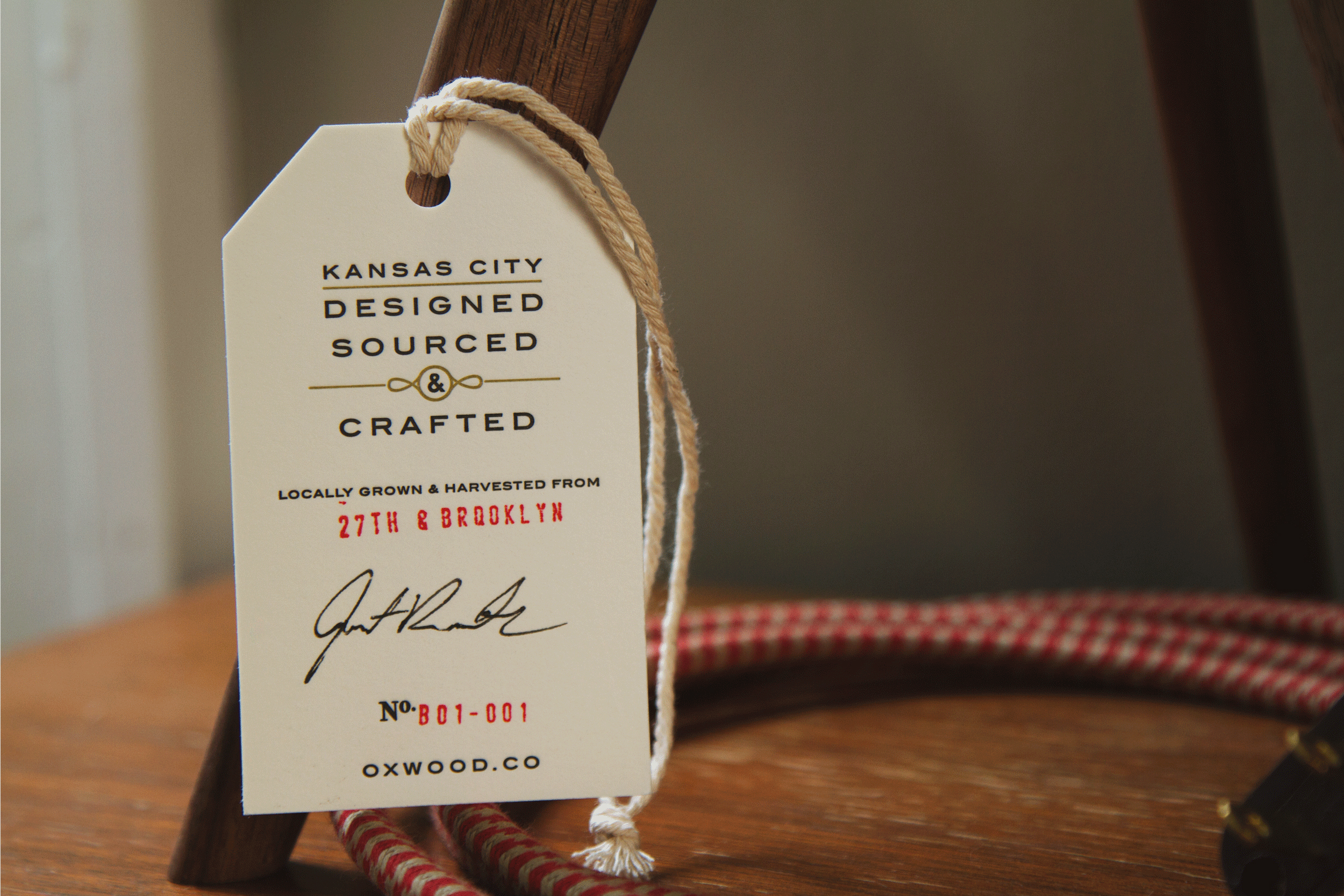
For a lamp this beautiful we wanted to give a finishing touch. A hang tag is possibly the most striking way to give the buyer the impression of this brand. We chose to letterpress these hangtags and leave them on during shipping. Some customers love the tag so much they leave it attached!
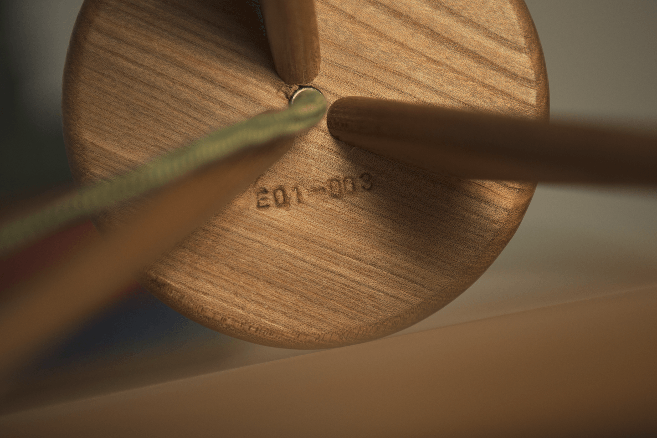
Each tag is hand numbered to match the serial number of the lamp. The maker then signs his name to his work (and the hangtag) to add one last artisanal touch.